Suzanne Bühler is a ceramist from Munich. She reached out to me for a new visual direction of her brand Purkeramik. Having already met her in person from a former pottery class, I was able to get a feeling for her very personal and gentle manner right from the start.
In order to get a better understanding, I’ve asked her to describe, what does she feel, when she makes pottery. The feeling is an essential topic here, as in this handcraft various senses are standing in focus.
In her answer there was one sentence, that captivated me especially:
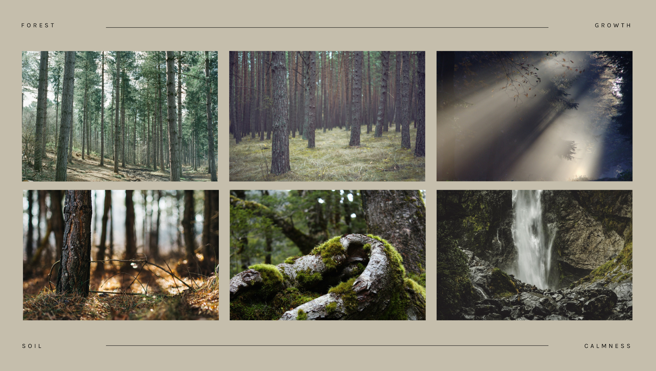
»Clay has the smell of forest ground after a rain, it touches me and a deep feeling of happiness flows through me.«
This was the key-takeaway for the visual concept. It had to be very intimate, unaffected and pure. The colors as well as the key-visuals are inspired by nature – the space which surrounds Suzanne, when she is in her flow. Hereby the forest is a metaphor for creation, while the ground/soil is the element of the clay material. The logotype had to be individual as well, so a handwriting font served here as a basis in combination with a secondary sans-serif font, in order to provide clarity.
»Ton hat den Geruch nach Waldboden nach einem Regen, das berührt mich und ein tiefes Glücksgefühl durchströmt mich.«
SUZANNE BÜHLER