

Disciplines:
Brand Design & Strategy,
Brand Positioning,
Web Design, Art Direction,
Content Design
Client:
theraforum.de
Disciplines:
Brand Design & Strategy,
Brand Positioning,
Web Design, Art Direction,
Content Design
Client:
theraforum.de
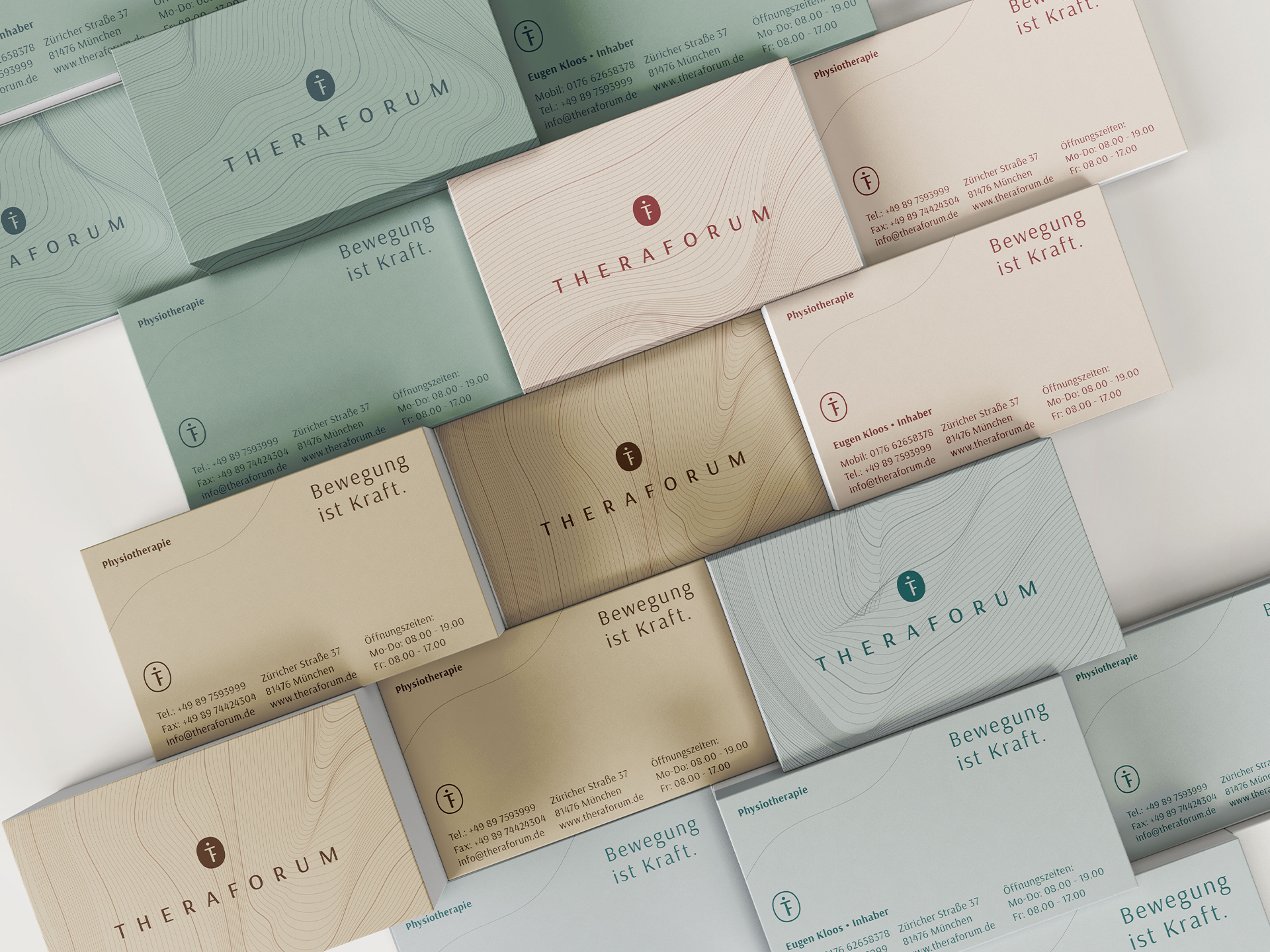
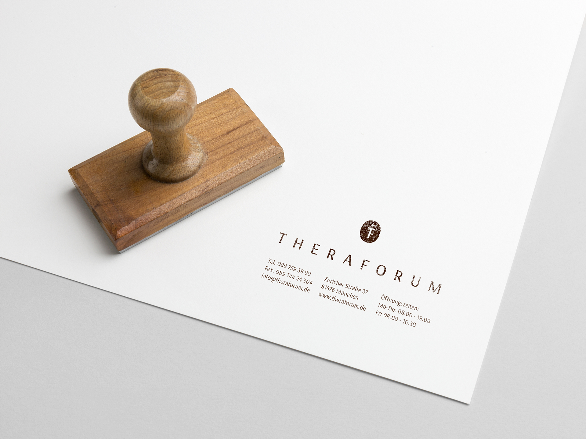
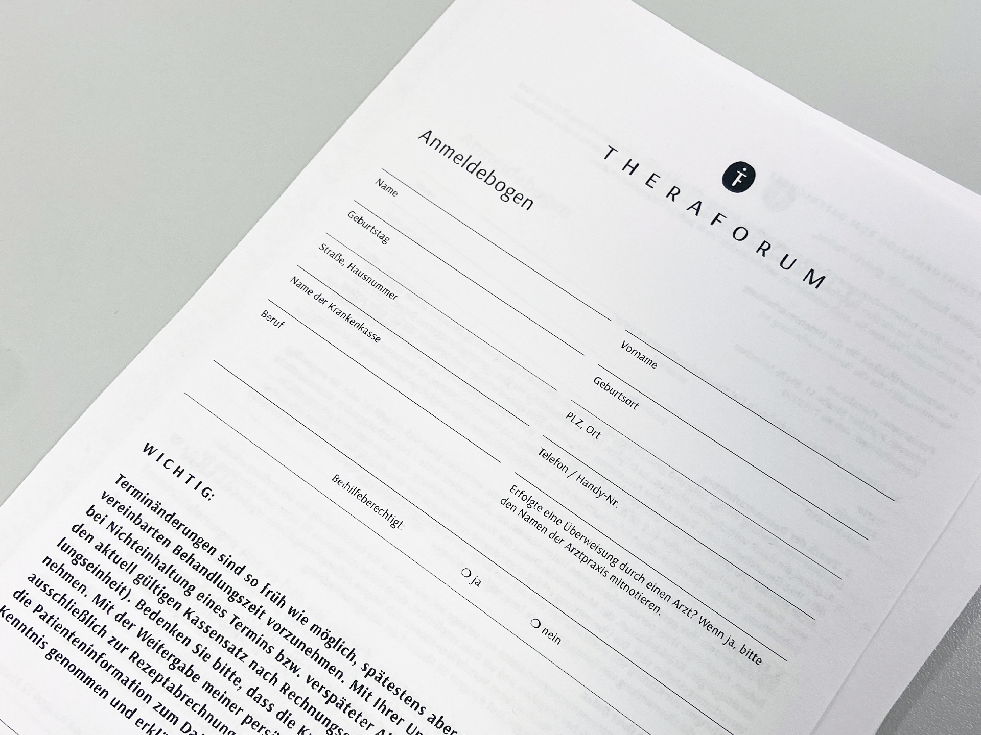
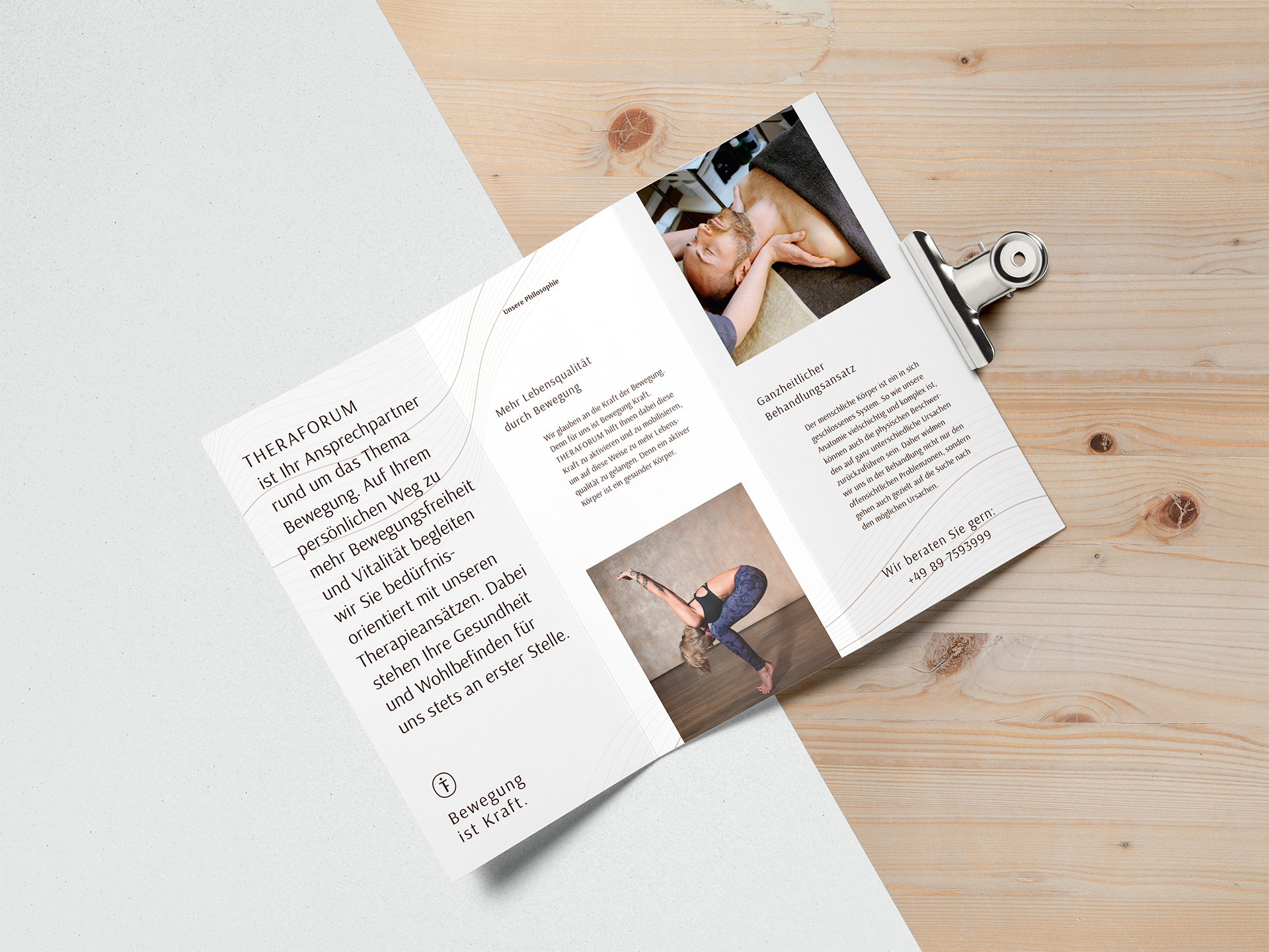
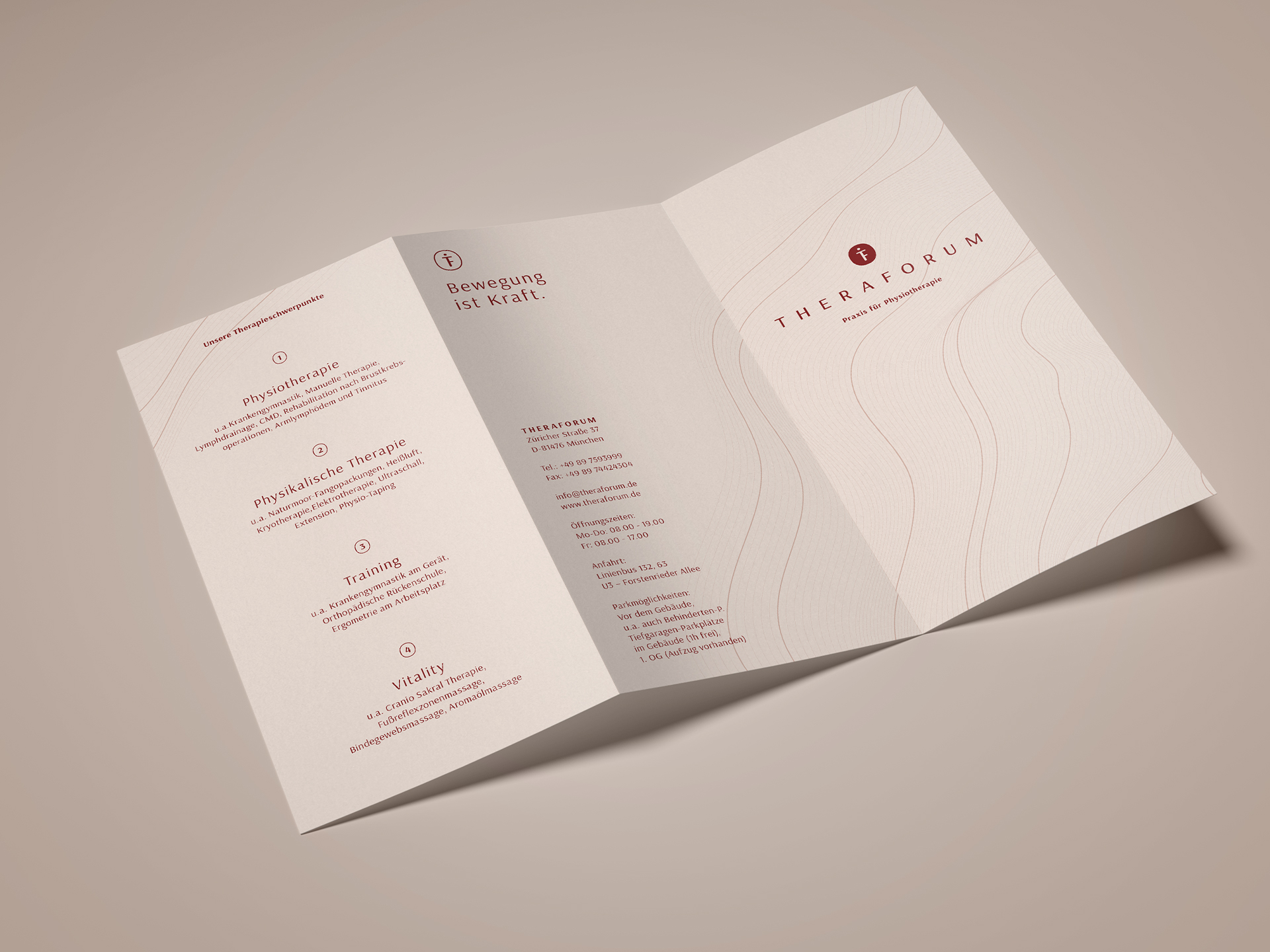
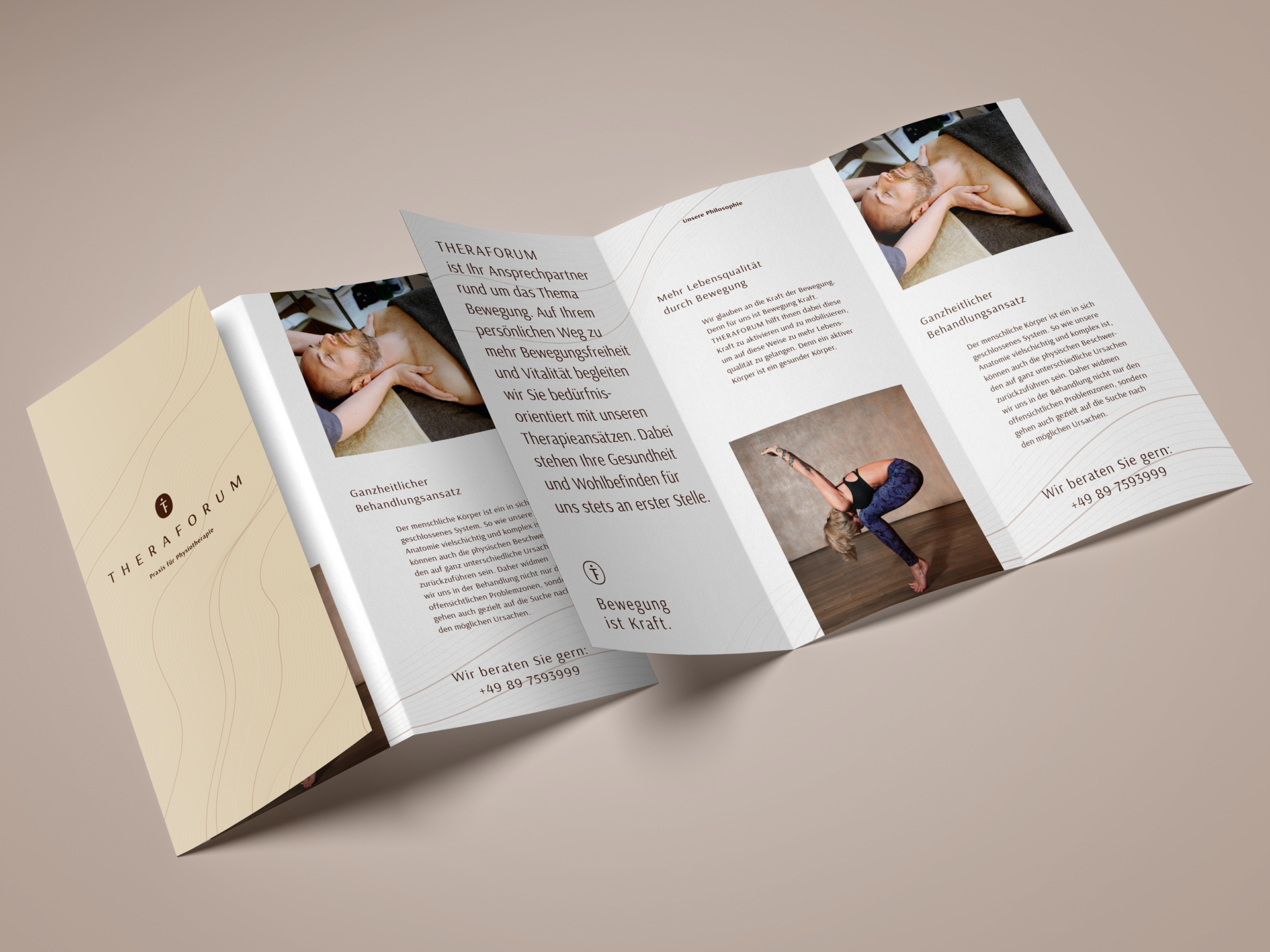
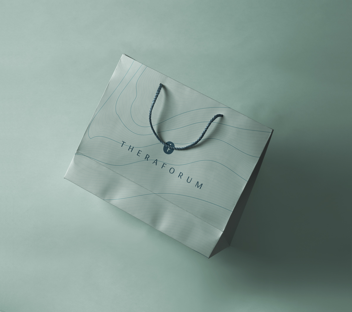
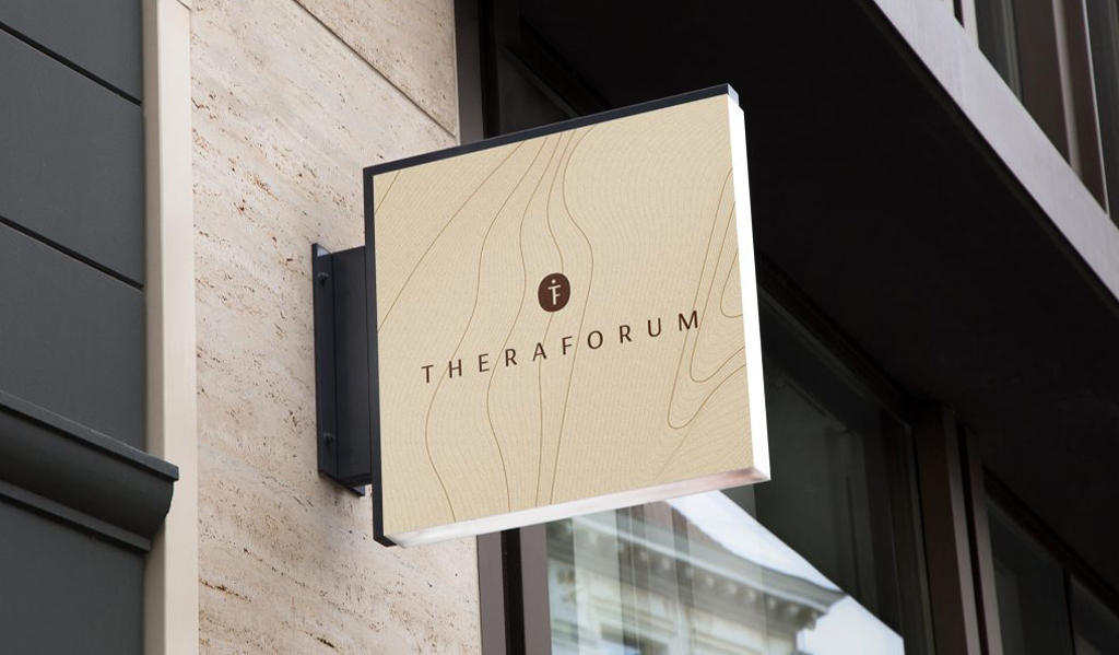
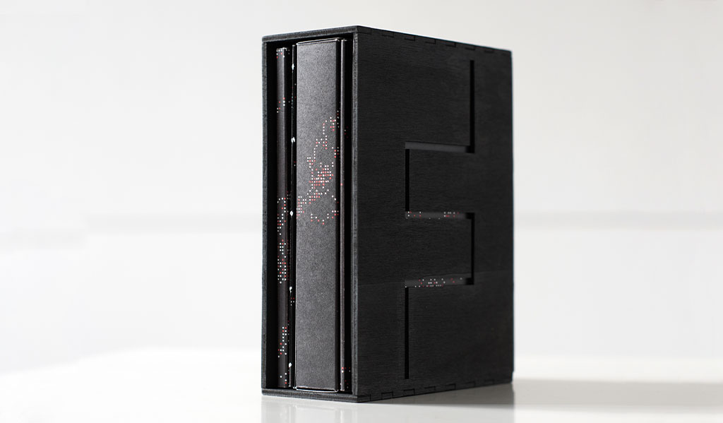
Theraforum is a physiotherapy practice from Munich. Their philosophy goes back to the basic forces of nature. The conviction of the power of movement is reflected in all media in form of graphic elements, colors and imagery.
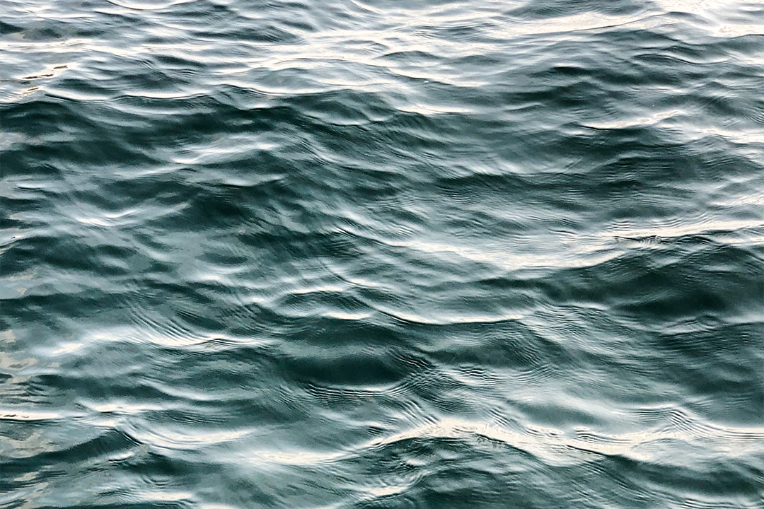
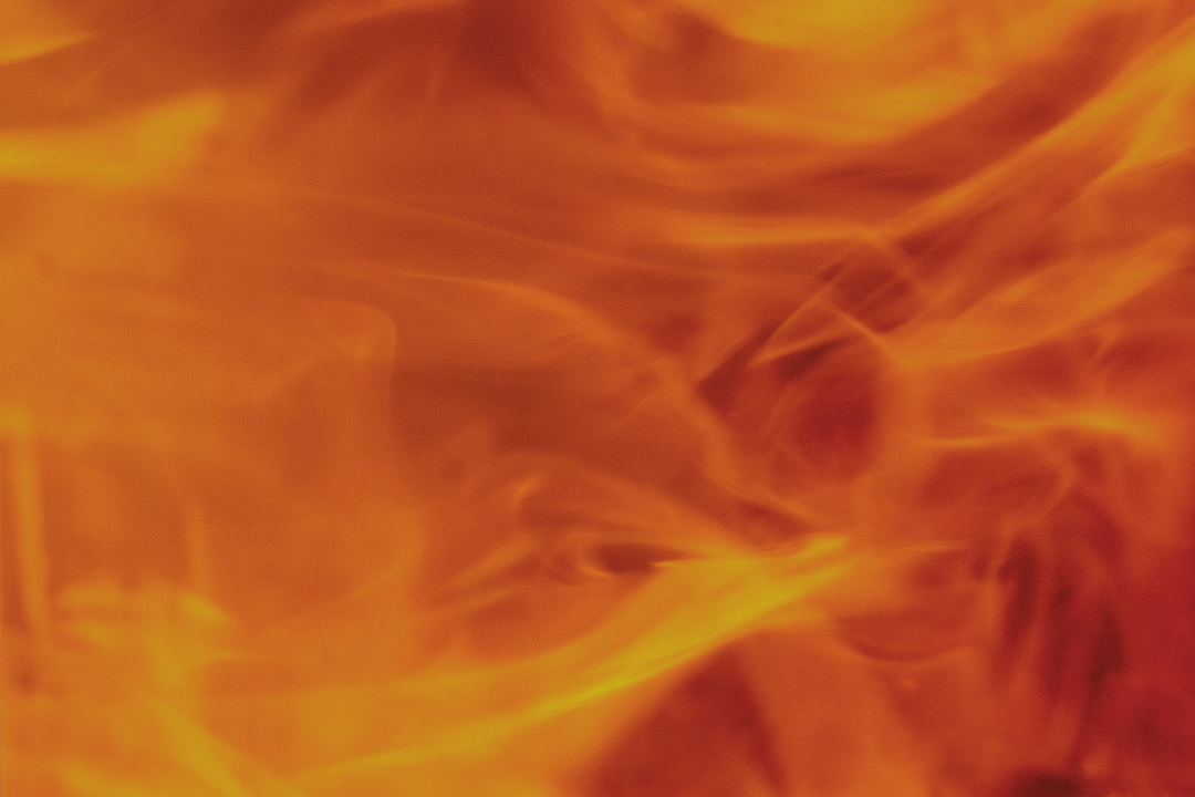
The color world is inspired by the four basic elements: soil, water, air, fire; while the dynamic keyvisual reflects the property of movement in an abstract way.
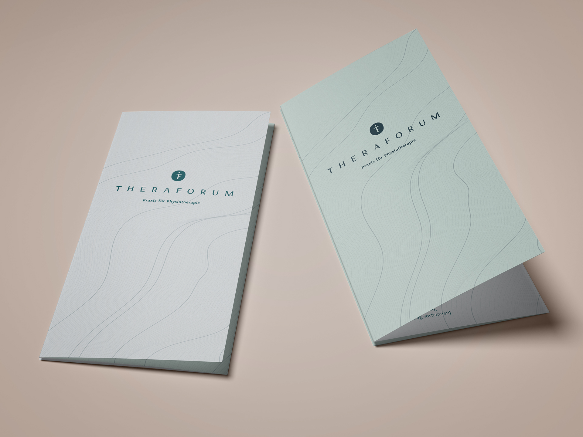
During the design process two visual concepts have been developed. The client has chosen the concept below for their visual identity. The second concept can be discovered in the explore section of this site. Feel free to take a look.
Theraforum is a physiotherapy practice from Munich. Their philosophy goes back to the basic forces of nature. The conviction of the power of movement is reflected in all media in form of graphic elements, colors and imagery.
The color world is inspired by the four basic elements: soil, water, air, fire; while the dynamic keyvisual reflects the property of movement in an abstract way.
During the design process two visual concepts have been developed. The client has chosen the concept below for their visual identity. The second concept can be discovered in the explore section of this site. Feel free to take a look.
Disciplines:
Brand Design & Strategy,
Brand Positioning,
Web Design, Art Direction,
Content Design
Client:
theraforum.de


